Beating old browsers: Responsive Web with JavaScript

Forget Grid Layout, forget the Flexbox, remember old browsers. I’ll show an example for frontend-based relayouting. No more stupid IFs in backend templates!
The concept
Basically, the idea is to have a piece of HTML that would be moved as a DOM hierarchy to new parent element (DOM node). As I want this solution to be generic, I won’t write JavaScript code for moving elements manually. Instead, let’s declaratively define in HTML when and where an element should move. Yes, in HTML. Would be nicer to do this in CSS but, oh, well.
Why even responsive?
- I don’t want to do this on backend because it’s much more messy - a choice between duplicated code or too many micro-templates
- mobile devices could be rotated between horizontal and vertical
- It’s easy to test on PC while development - less refreshing, just resizing the browser as with media queries :)
Example
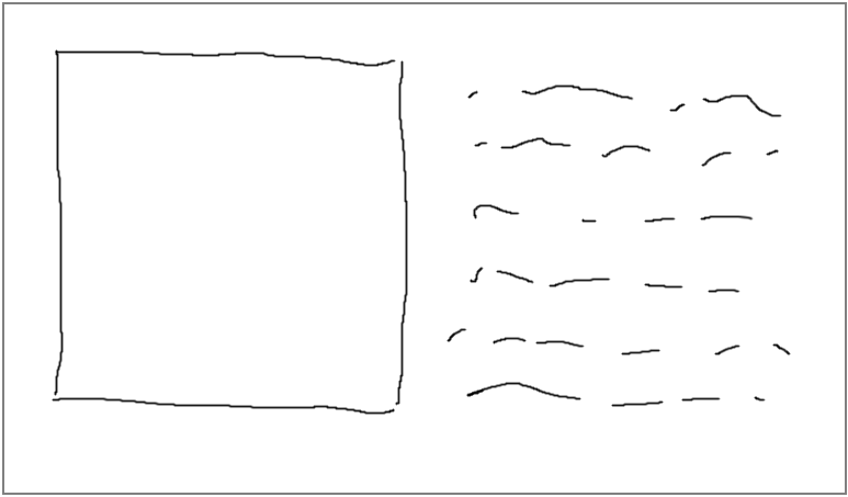
For instance, let’s have a product picture and product description near each other - column by column.

Desktop version of the website
Now, on mobile phones (let’s say width=375px like iPhones) it would be the picture on the top and description on the bottom.

This is really simple to deal with media queries. However, believe there are much more specific relayouts where you cannot even count on Flexbox. And grids… are too far away.
My solution
<div
	class="product-description move-filled"
	move-when-narrower="376"
	move-to-element="product-description"
>
	<!--- lots of HTML here --->
</div>
Now, the contents of this <div> would be moved to a place defined by move-to-element attribute.
Like this one:
<div
	class="product-description move-empty"
	move-target="product-description"
></div>
Important notes here:
- the value of
move-to-elementlooks for element with move-target attribute of same value move-filledandmove-emptyclasses are defined manually here, but it’s also automatic. Manual choice was because of one less relayout after JavaScript is loaded and executed.move-filledmeans nothing, you could define it however you like in CSSmove-emptyis just a class defininingdisplay: none !important;so the empty element doesn’t take any space
.move-empty { display: none }
.move-filled { /*whatever you want or nothing*/ }
Now, the code!
Implementation
/////////////////////////////////////
// Responsive Web with JavaScript
//
!(function() {
	window.addEventListener('load', function() {
		refresh(true);
	})

	window.addEventListener('resize', _.debounce(function() {
		refresh();
	}, 500));

	function refresh(isFirstTime?: boolean) {
		var width = window.innerWidth || document.documentElement.clientWidth || document.body.clientWidth;
		var els = $da('[move-element]');

		for (var i = 0; i < els.length; ++i) {
			var el = els[i];
			var name = el.getAttribute('move-element');
			var boundary = el.getAttribute('move-when-narrower');
			var targetEl = $d('[move-target="' + name + '"]');

			if (width < boundary && el.childNodes.length > 0) {
				moveElements(el, targetEl);
			}
			else if (width >= boundary && targetEl.childNodes.length > 0) {
				moveElements(targetEl, el);
			}
			else if (isFirstTime) {
				refreshClasses(el, targetEl, el.childNodes.length === 0);
			}
		}
	}

	function moveElements(sourceEl, targetEl) {
		while (sourceEl.childNodes.length > 0) {
			targetEl.appendChild(sourceEl.childNodes[0]);
		}
		refreshClasses(sourceEl, targetEl, true);
	}

	function refreshClasses(sourceEl, targetEl, sourceIsEmpty) {
		Utils.defineClass(sourceEl, 'move-empty', sourceIsEmpty);
		Utils.defineClass(targetEl, 'move-empty', !sourceIsEmpty);
		Utils.defineClass(sourceEl, 'move-filled', !sourceIsEmpty);
		Utils.defineClass(targetEl, 'move-filled', sourceIsEmpty);
	}
})();
The code above is pretty straightforward, probably needs no commentary.
